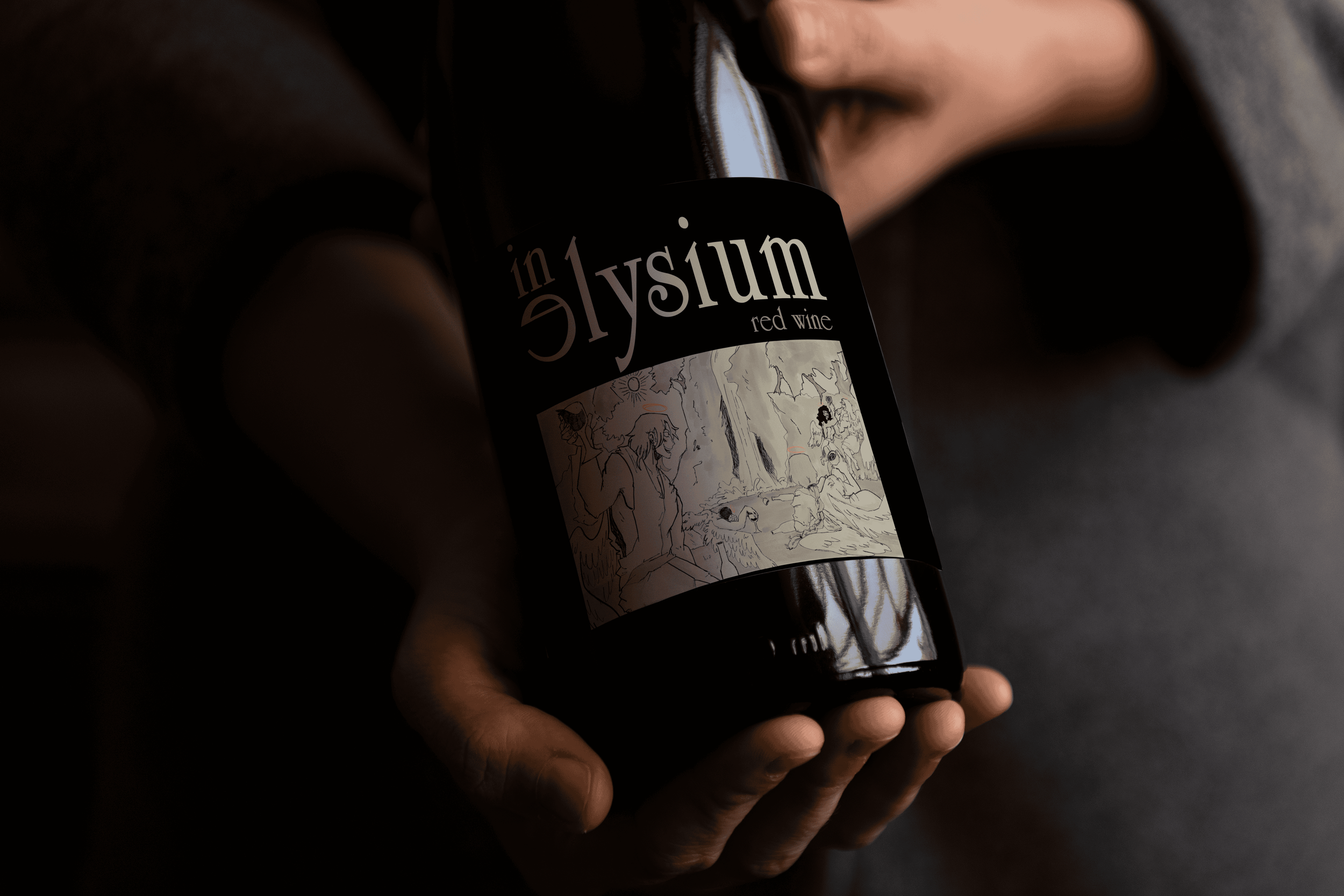

WINE LABEL
design brief + RESEARCH
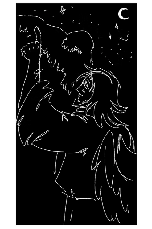
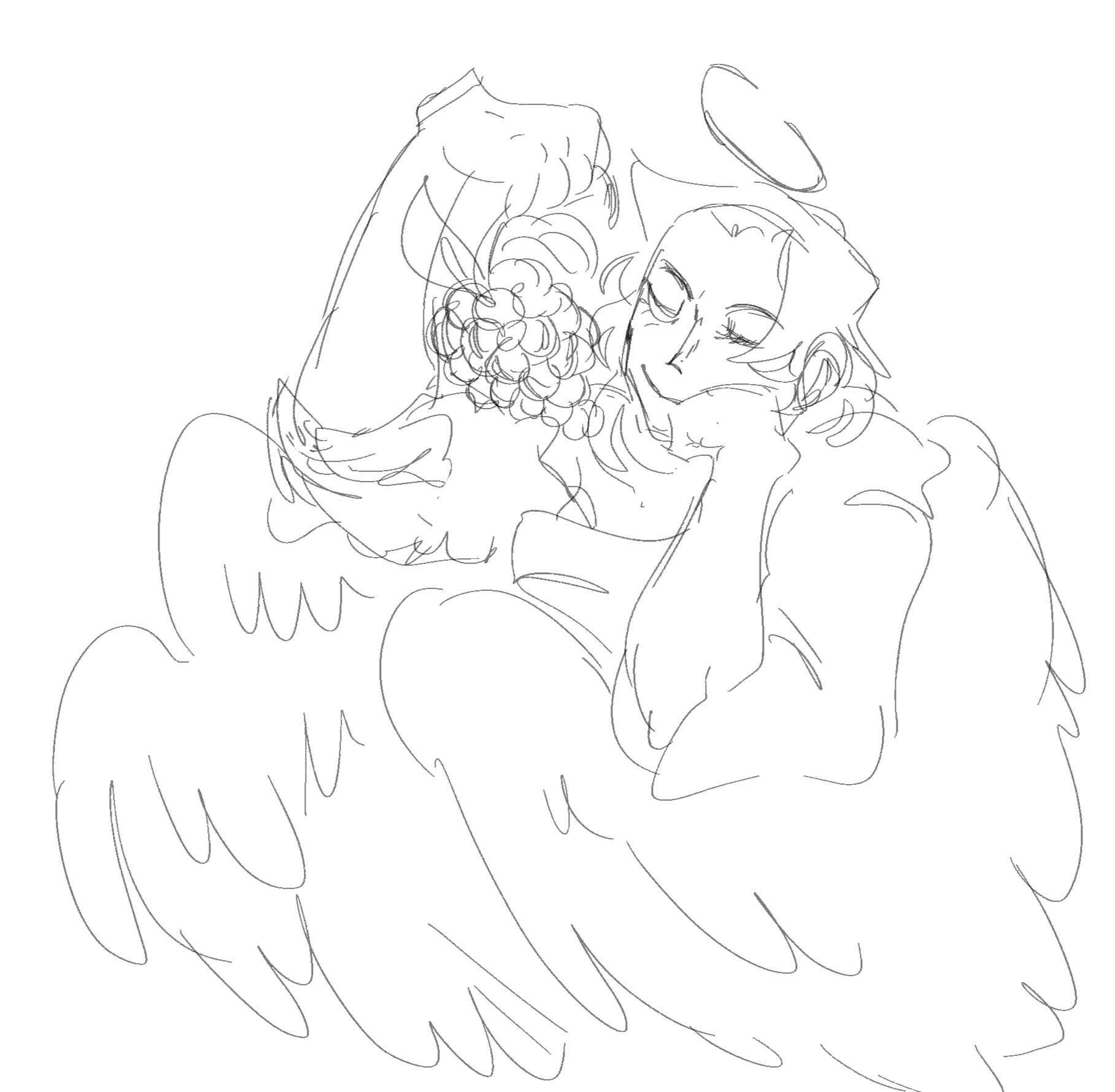
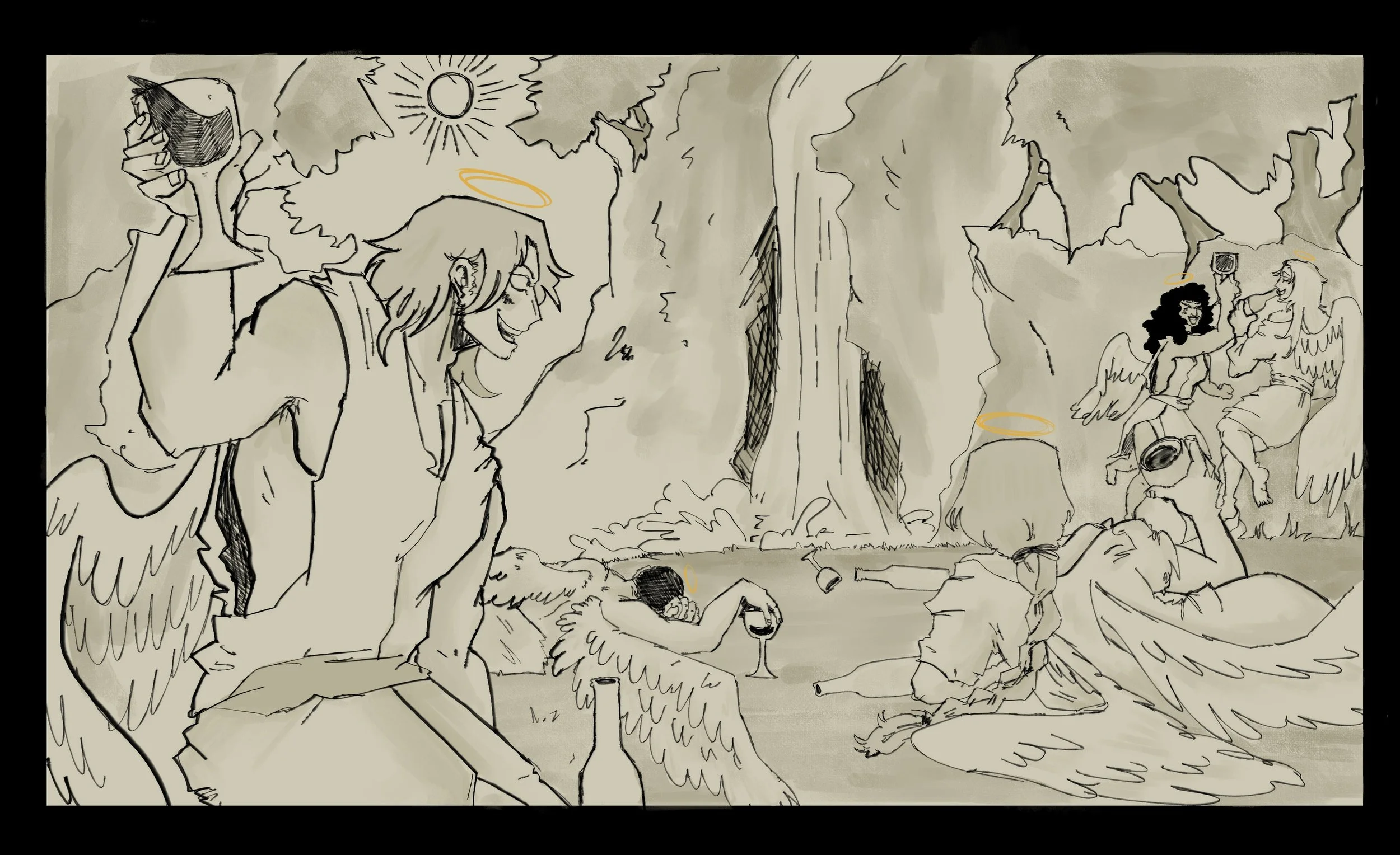
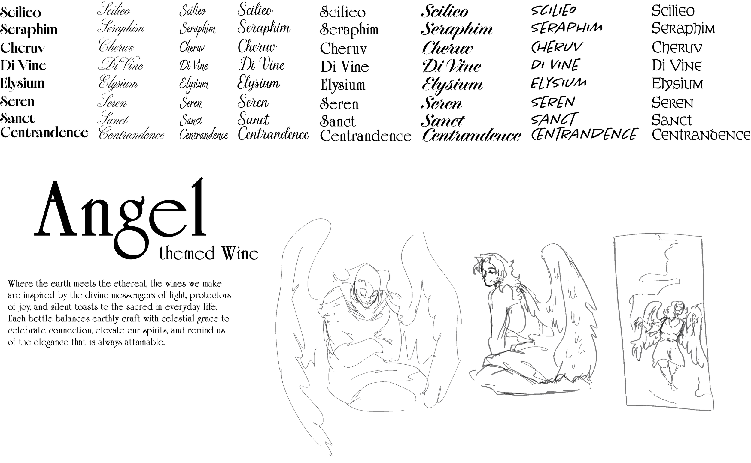
I was tasked to either create a brand-new wine label or revamp an old one. This label could gravitate towards an experimental or classic style. I wanted to start from scratch with a new experimental wine label and form a narrative about it with my design. I looked at a lot of more illustrative designs for wine labels, as that was the direction I was interested in. I also knew that really wanted it to be themed around angels, and the idea of paradise. SKETCHES

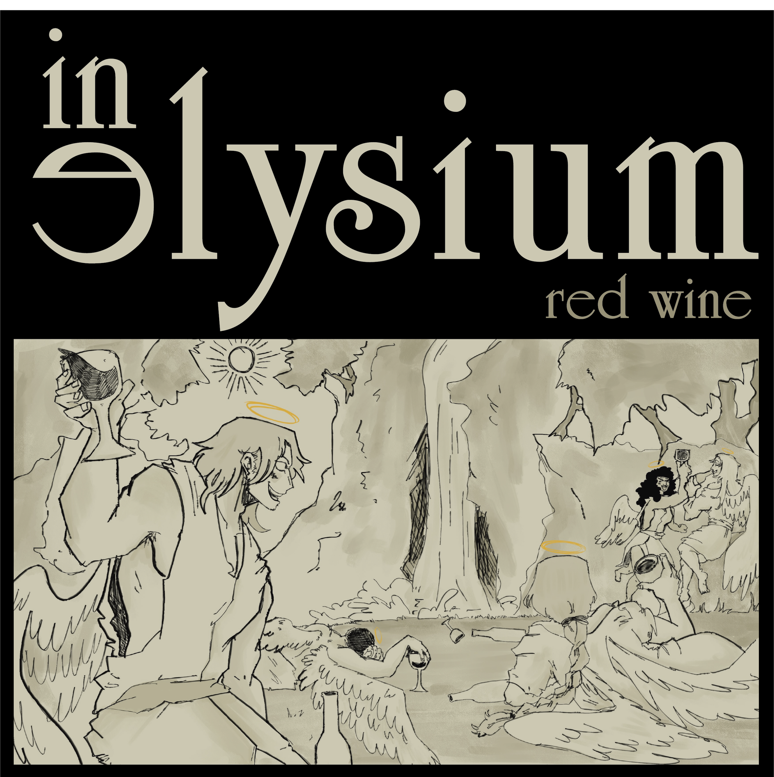
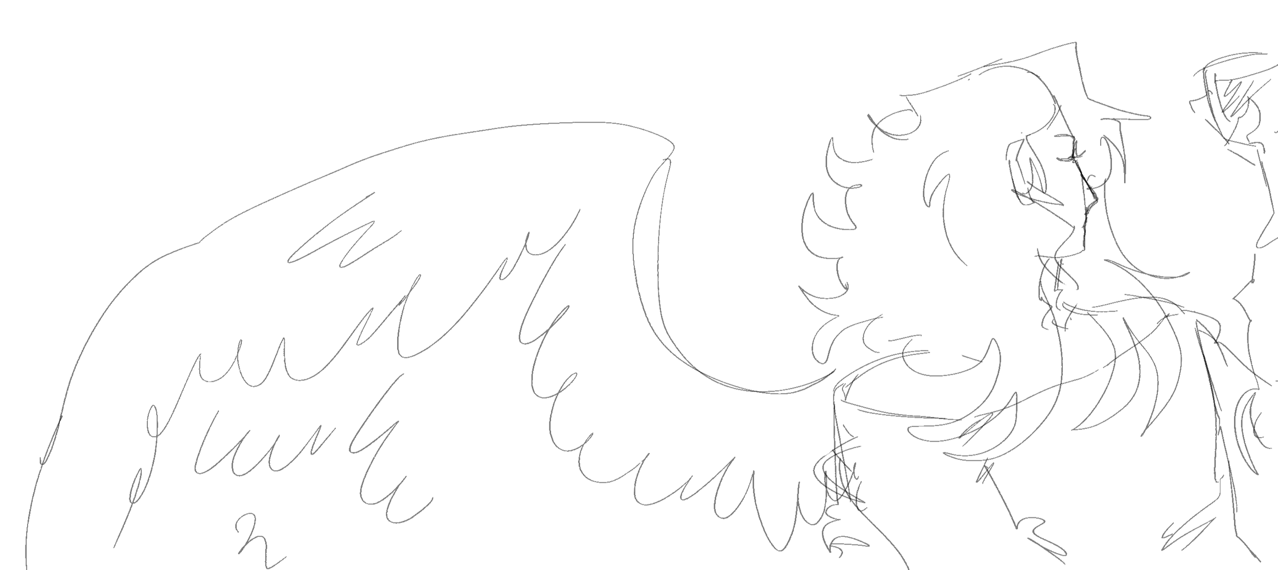
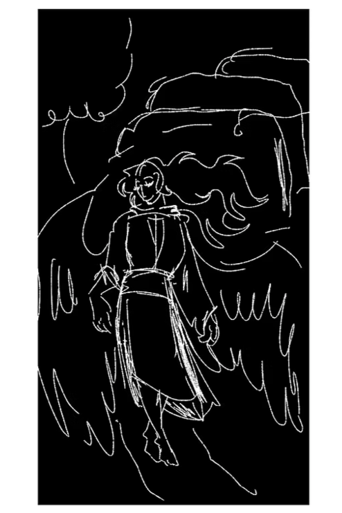
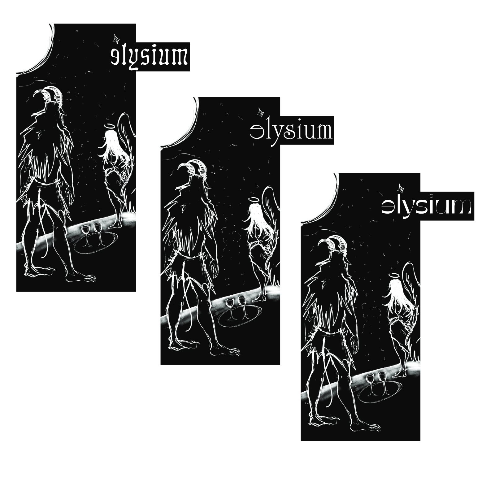
I originally wanted to keep the colors black and white for the label's illustration, and tried out several layouts with and without the logo. I had also tried a few different compositions and scenes for the illustration. After several sketches, I decided to use more color, and went in a different direction for the style of the label, but I kept the theme. I went with a light main color to contrast with the dark background of the label. I also made sure the illustration would relate to the name. I chose to put angels in a environment that seemed peaceful, relaxing, a place that could relate to paradise, and had hem looking relaxed, and having fun. 
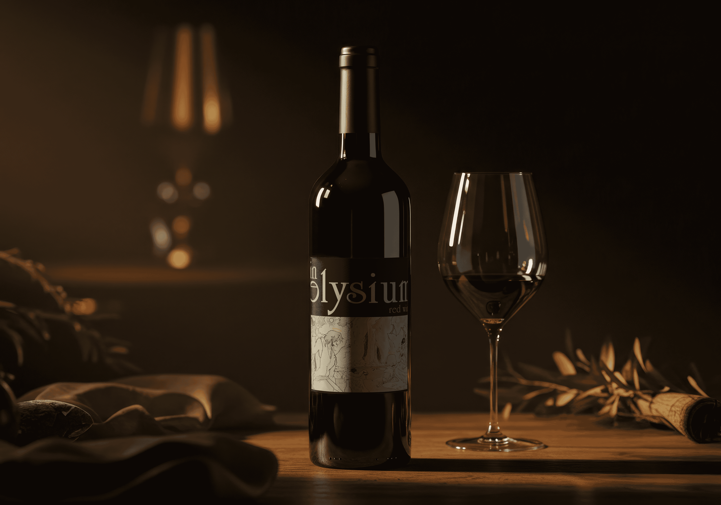
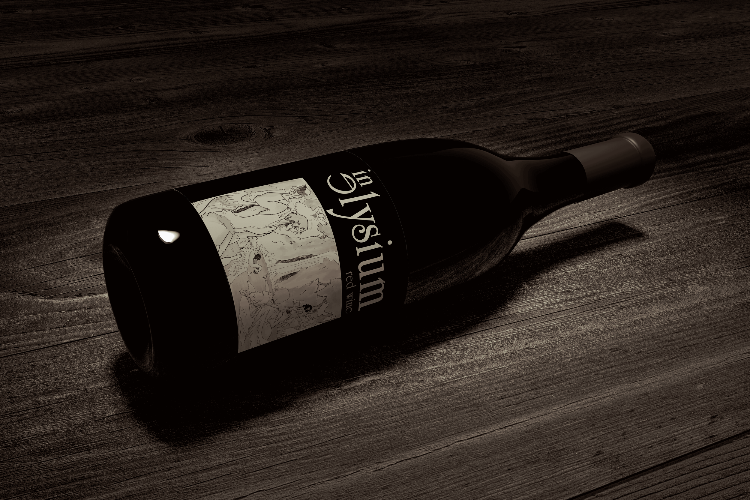
FINAL