EXPERIENTIAL DESIGN
SKETCHES FOR LOGOTYPE
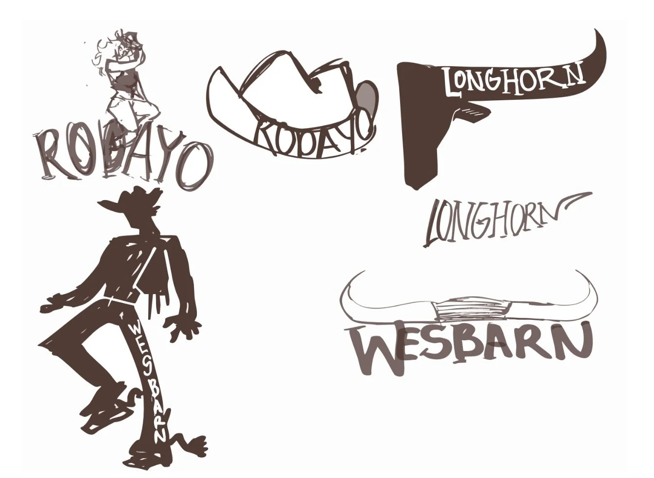
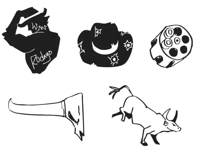
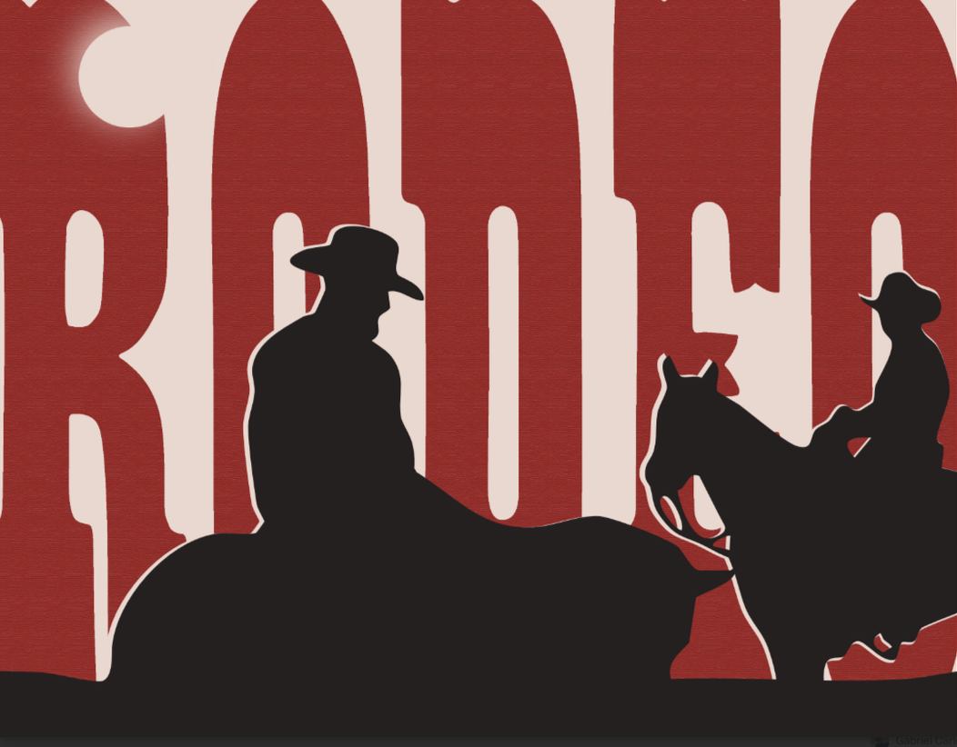
I knew from the beginning that I wanted to do something related to Western/Cowboy culture. I had three original ideas, but the Western idea had ended up being the most prominent in sketches and planning. I wanted to focus on design and branding for a western bar.I had really wanted a more illustrative logo in the beginning, but I had realized it would be better to keep the logo simpler, and save the illustration for the guidebook and further sections in the project, and settled for a more typographic design for the bar logo. 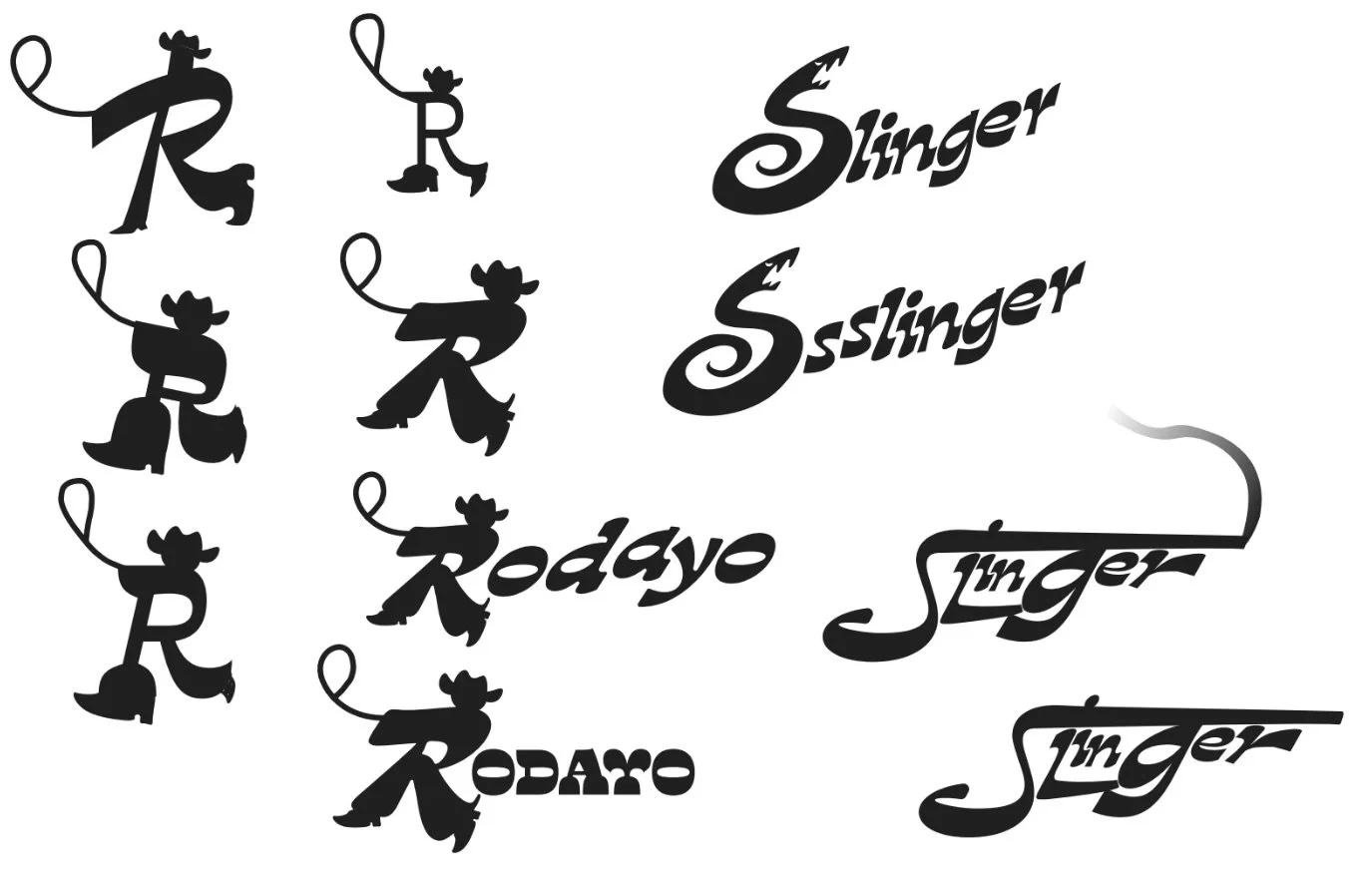
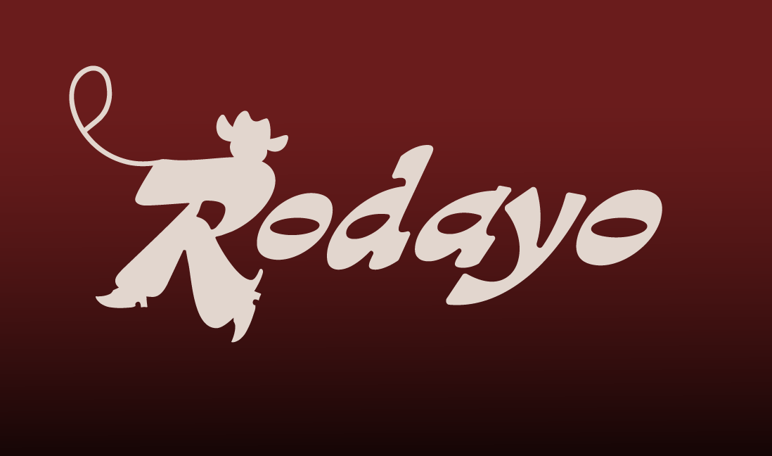
FINAL LOGOTYPE
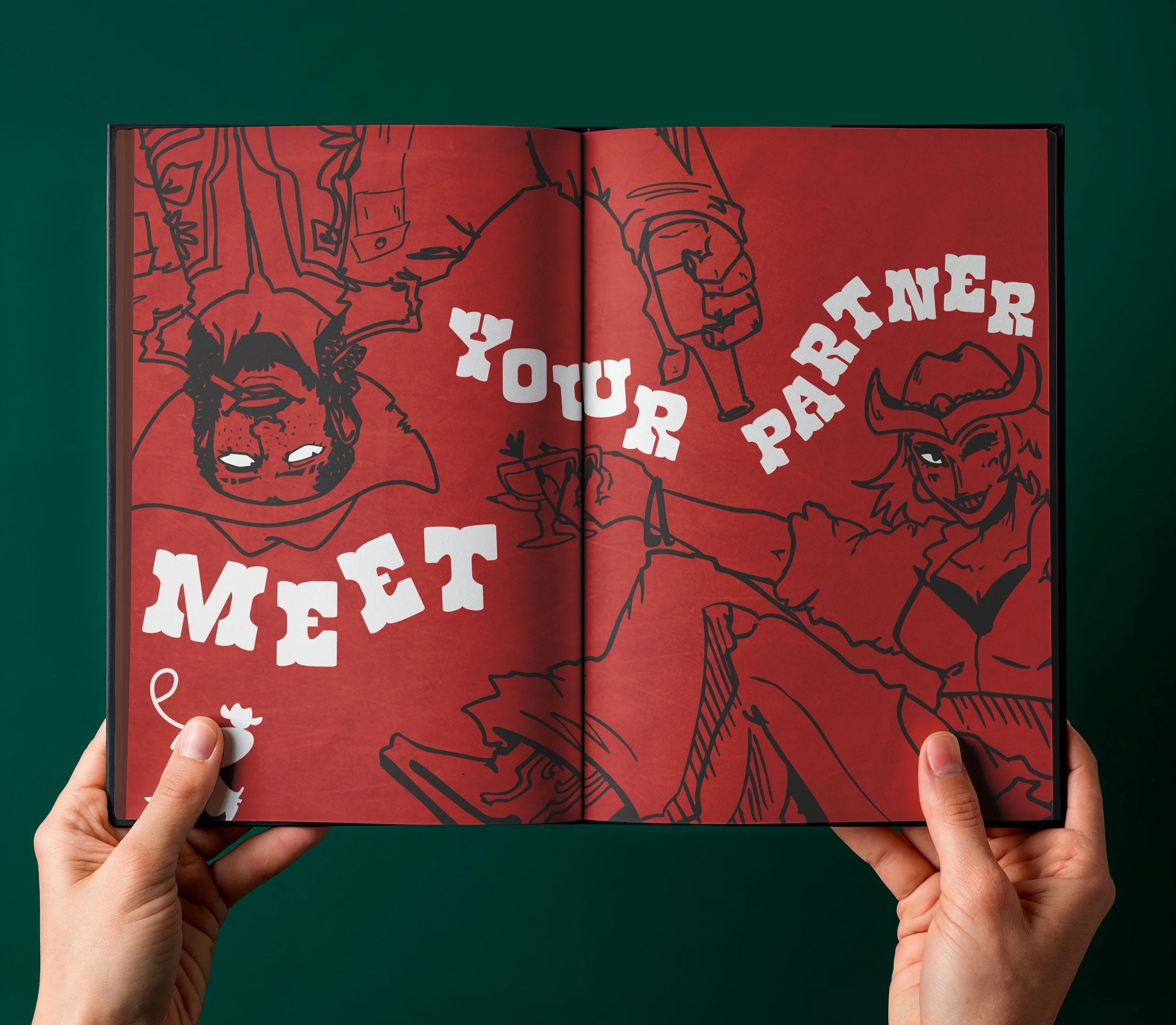
GUIDEBOOK
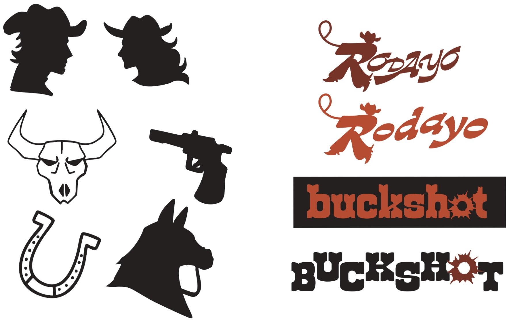
I ended up going with a different version of the word “rodeo".” I thought it was unique and had a playful tone to it, and it would be fitting for the name of bar. I found so many fonts with the letter R having a very dynamic feel to them, so I decided to turn an R into a little cowboy with a lasso, without diminishing the identity of the R in the logo.
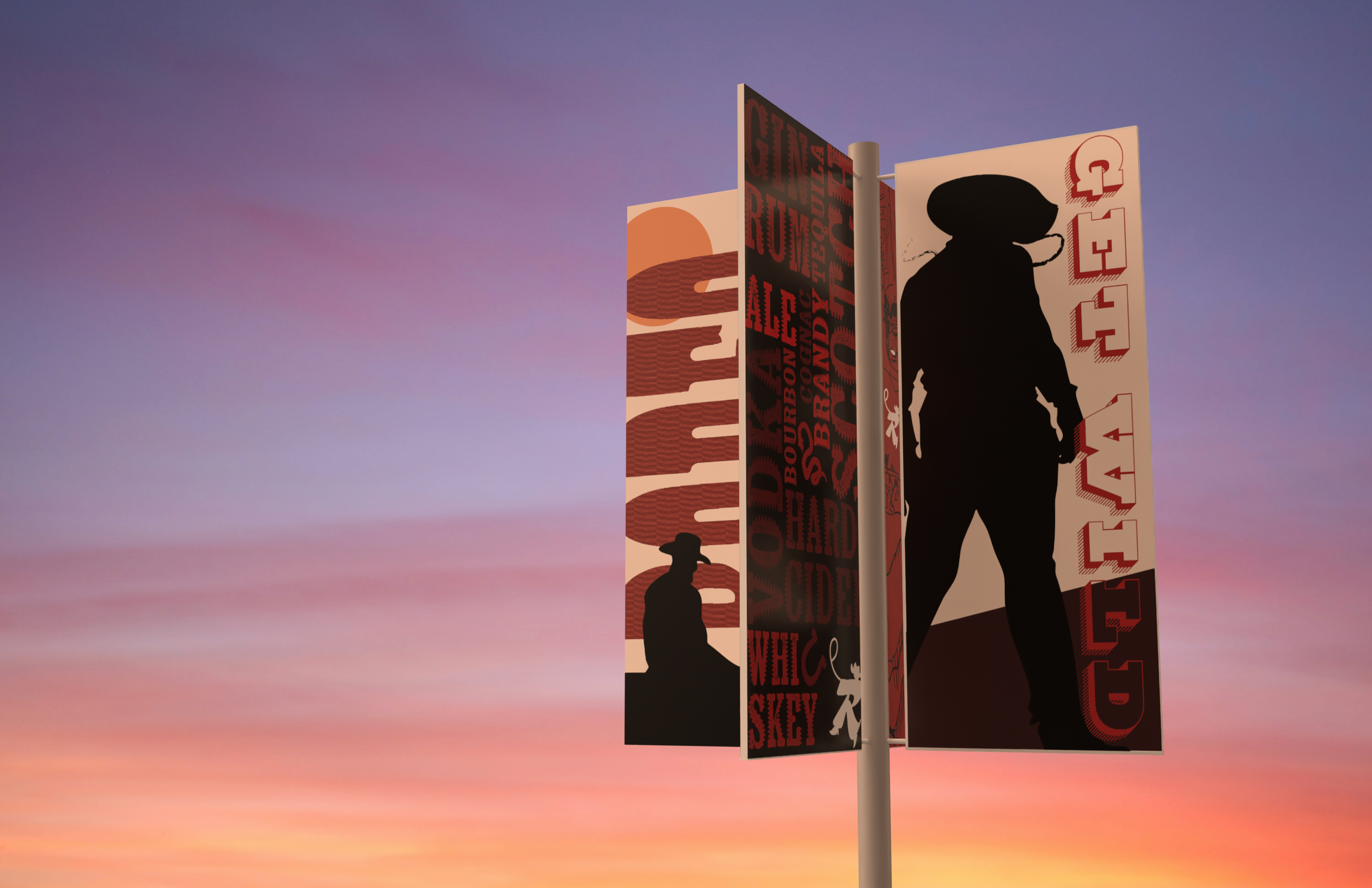
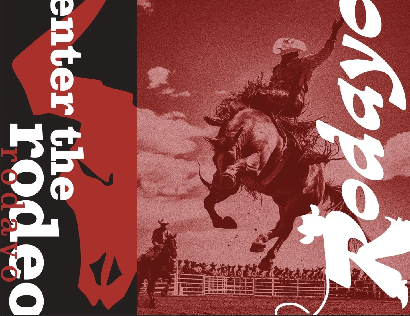
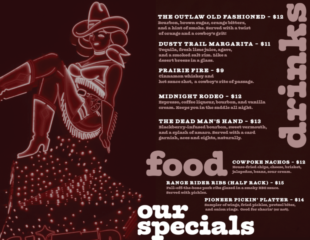
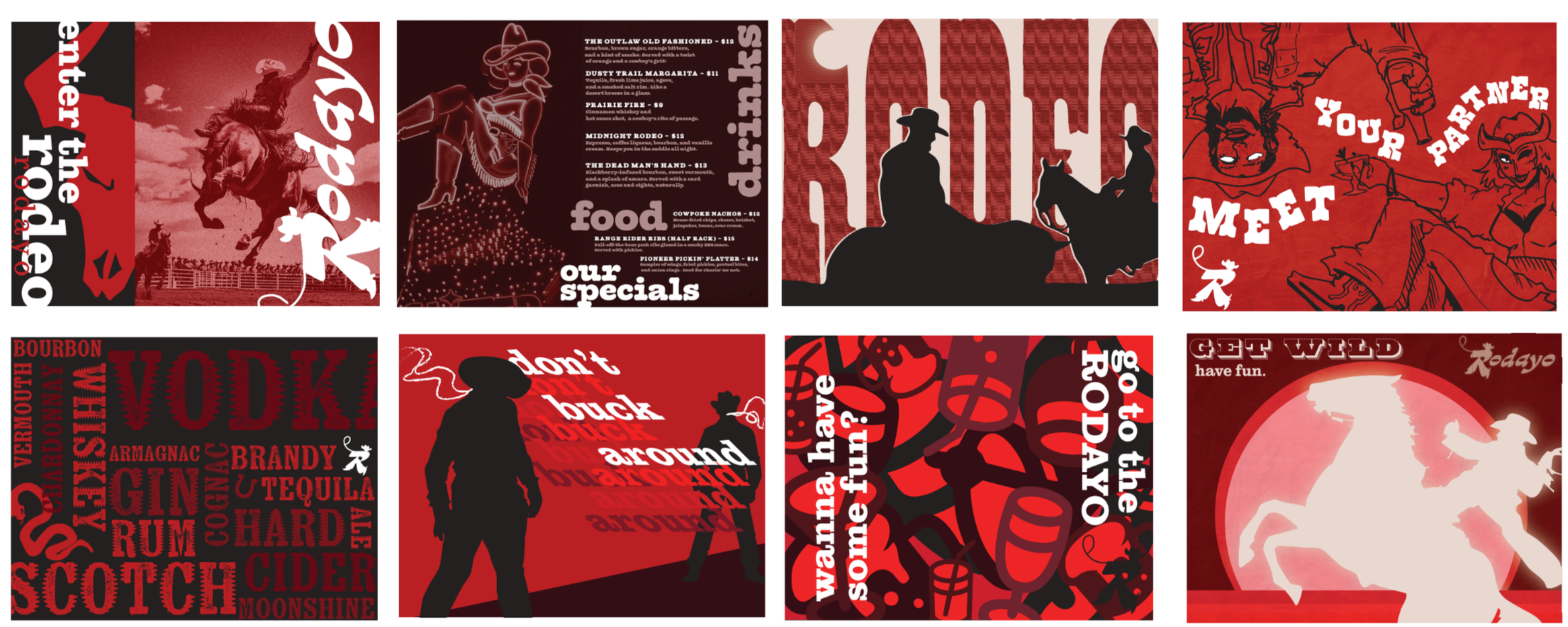
I decided with the guidebook that I would use a mix of illustration and photography to form some brand identity for my cowboy bar. I used a lot of red, I wanted that to be a main color for the branding, I think it also works with a lot of colors and in a lot of different tints and shades.
I really just wanted to have fun with it. I included elements that would relate both to the western theme as well as the bar. I used plays on words as well as creating fun catchphrases. I even made a western themed menu!
all spreads