
GAME MENU AND ART BOOK
GAME MENU Sketches
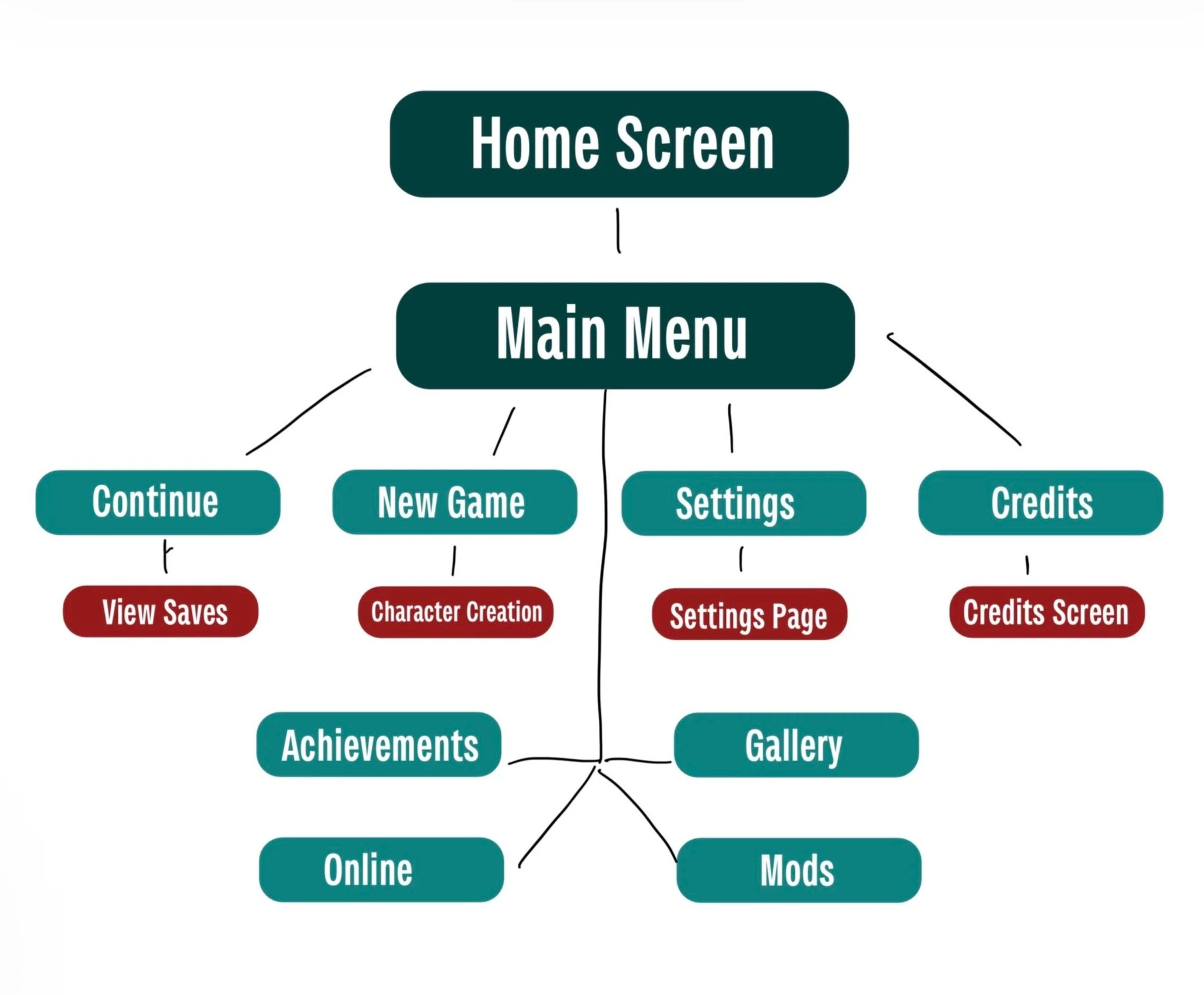
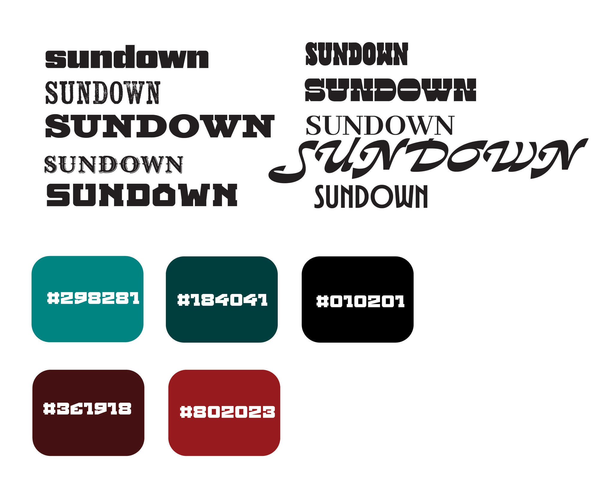
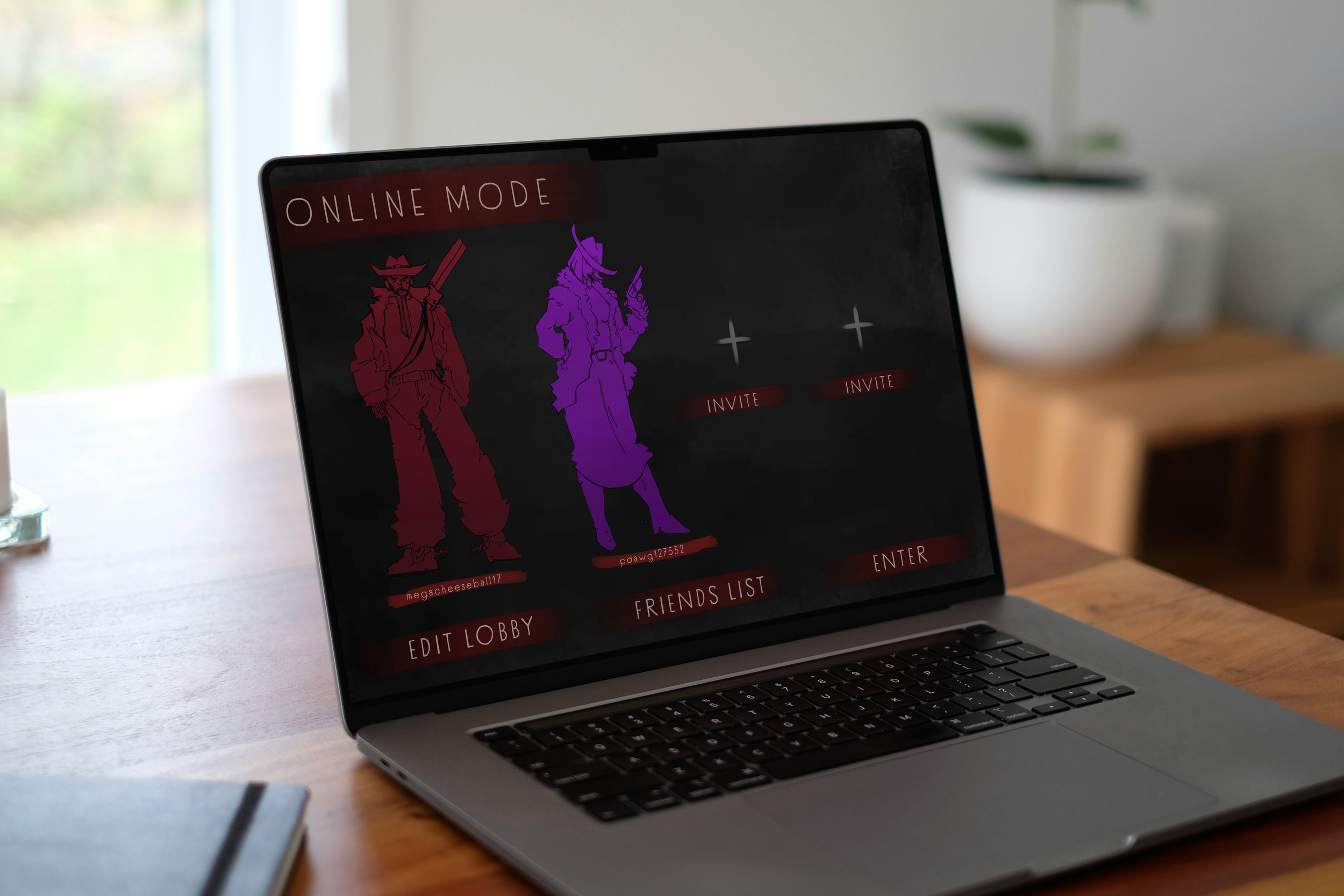
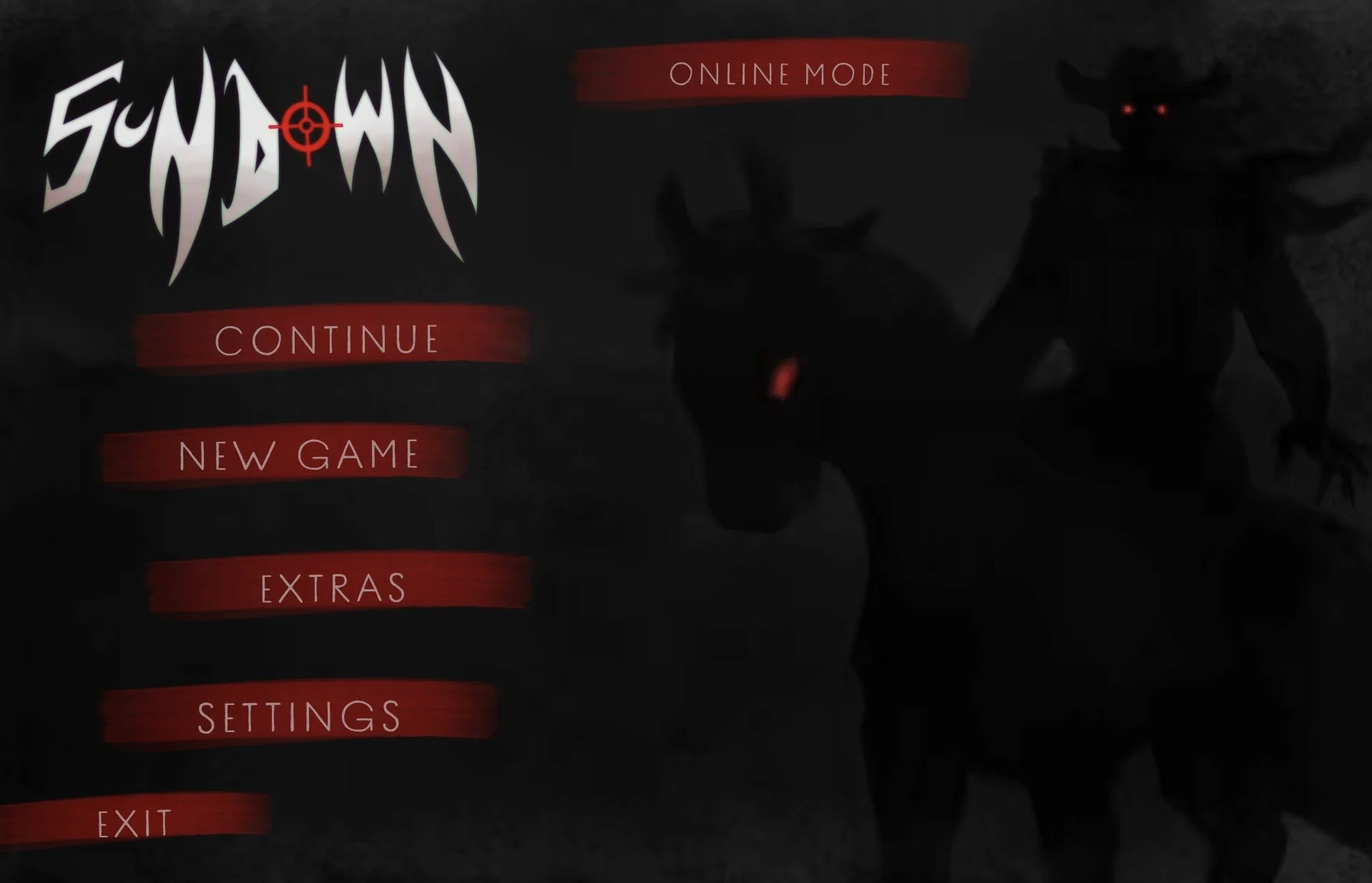
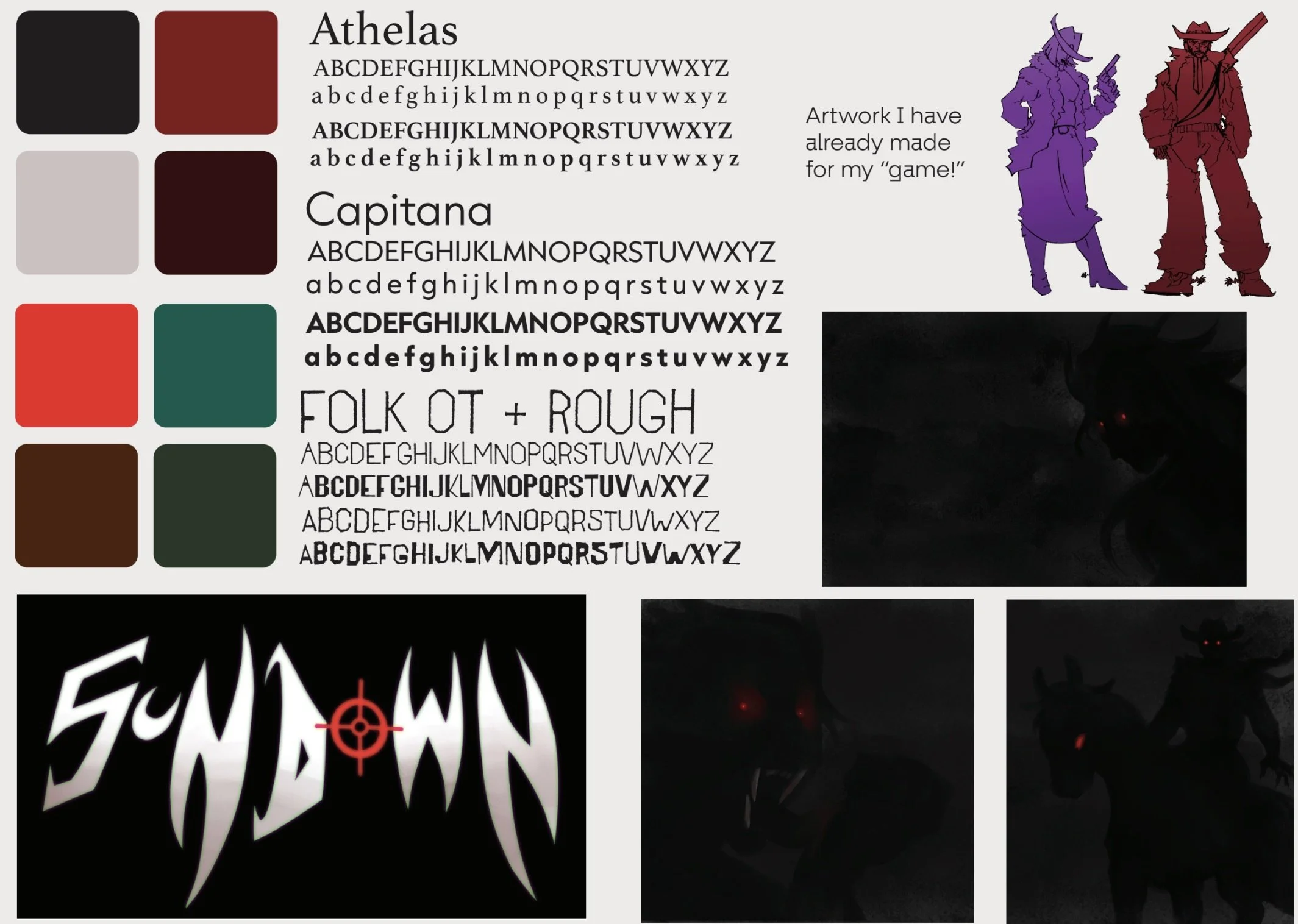
I had red and black as the main colors for the pages of the menu because I feel those colors always go great together, and that the red sections would pop and contrast well with the dark backgrounds. Once I had the main sketches laid out for the pages, I knew all I really had to do was finalize the details of them in Figma. My final pages look pretty much identical to my sketches for them. GAME MENU Final
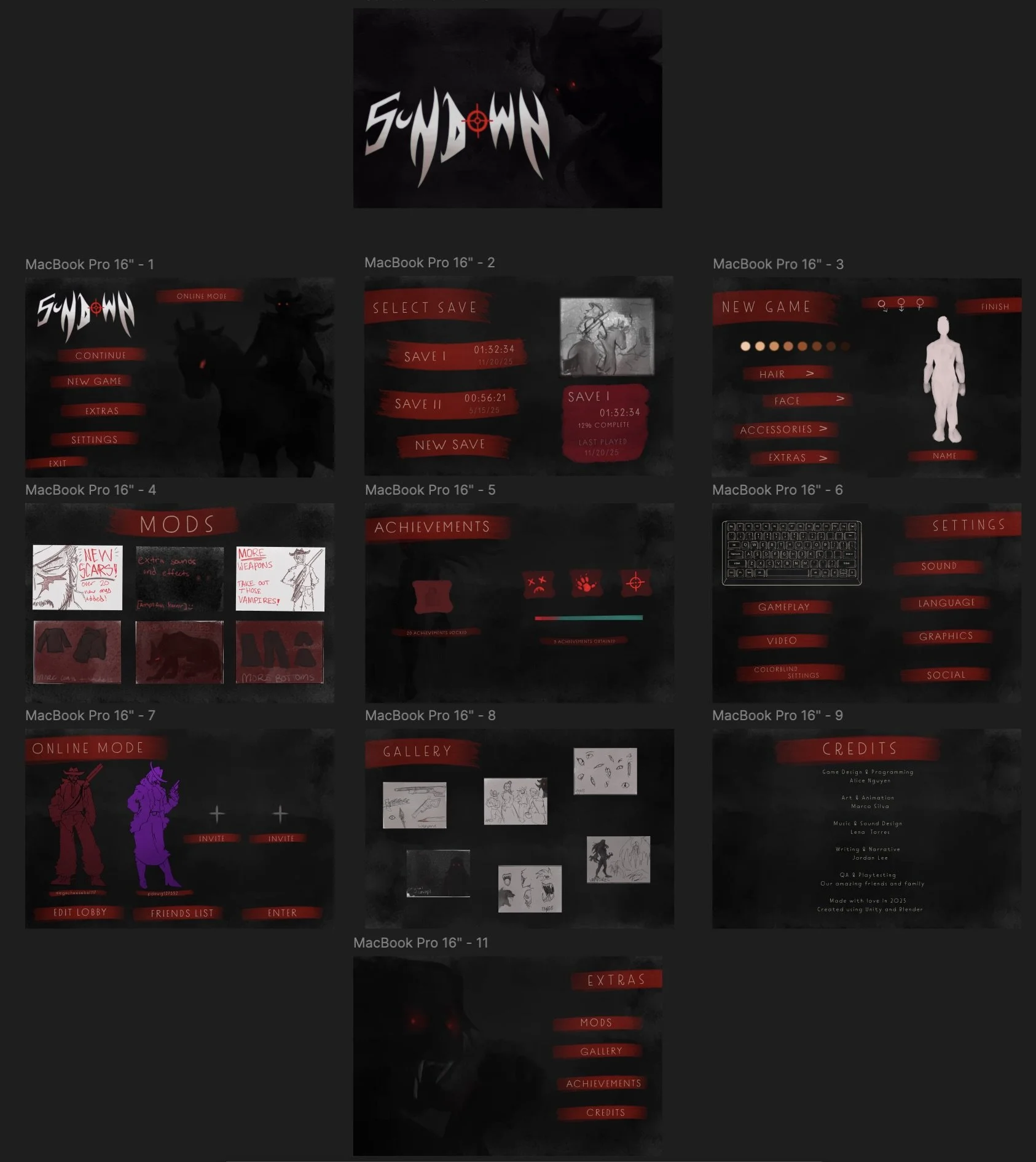
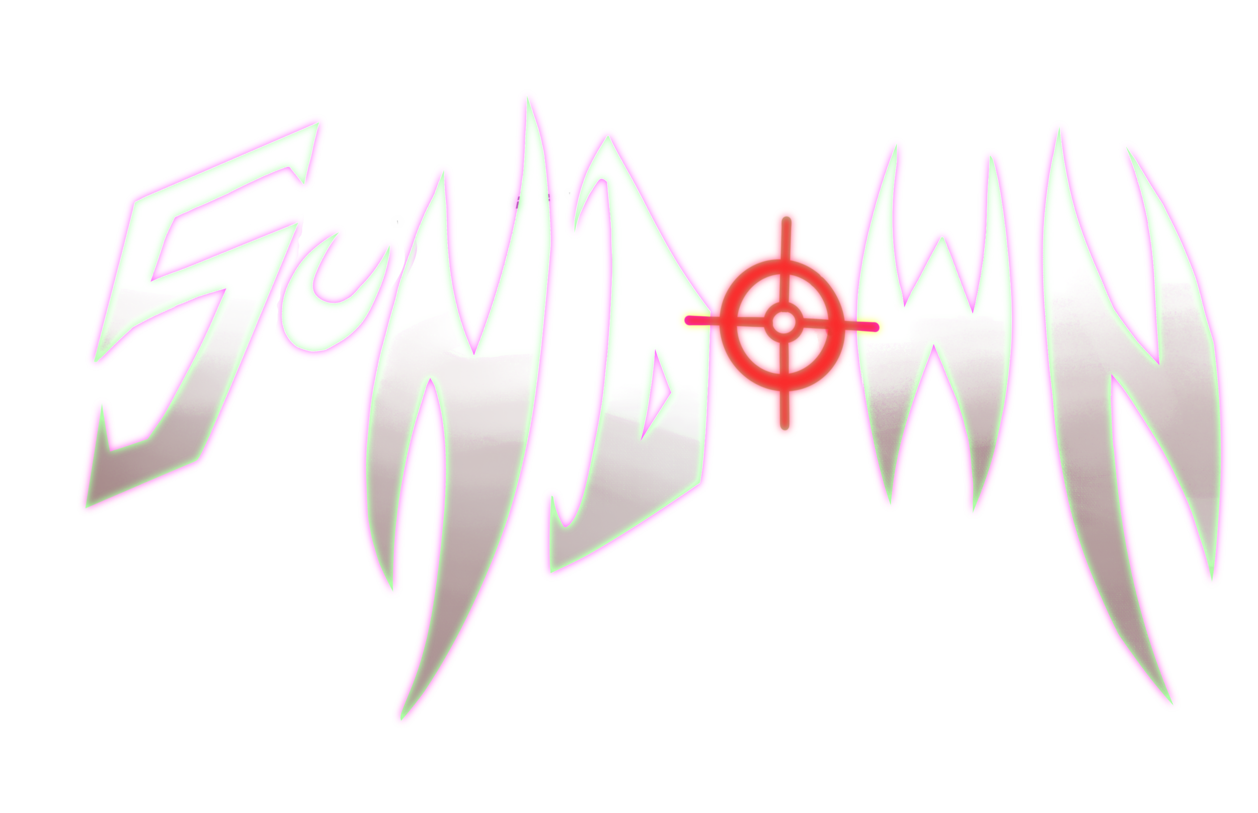
I already had a pretty good idea of the colors and style of the menu I wanted, so I chose to figure out the layout of the pages first.I had been looking at fonts for the main logo of my game, but I ended up just hand illustrating it. One I had those things established, I decided to go in and sketch how the pages will look. 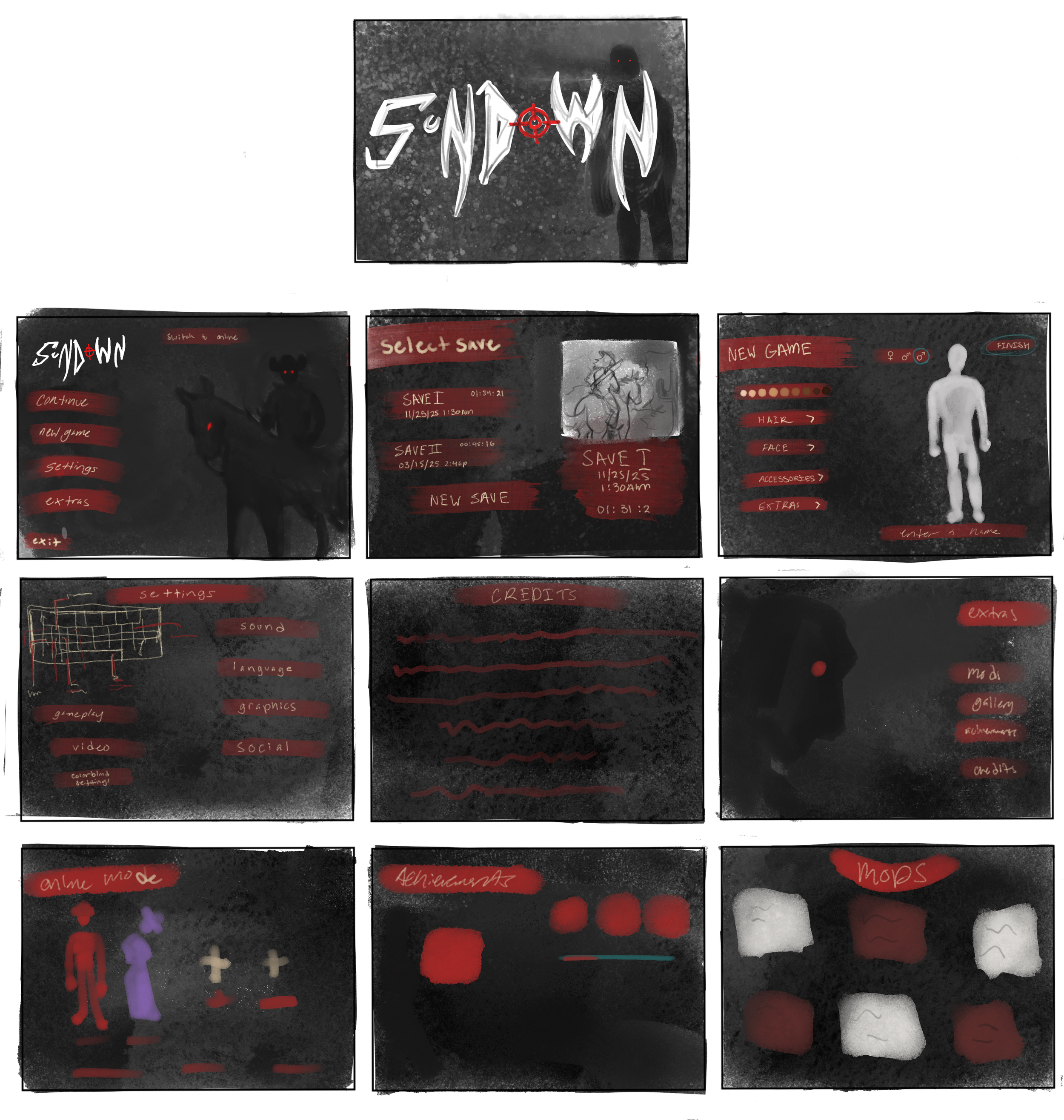
I was given a week and a half to make the UI design for anything of my choosing. I had been most interested in doing a game menu for a horror game concept I had been thinking on. I decided to expand on the concepts further by working on a art book for the some of the characters and settings that would have been present in the game. 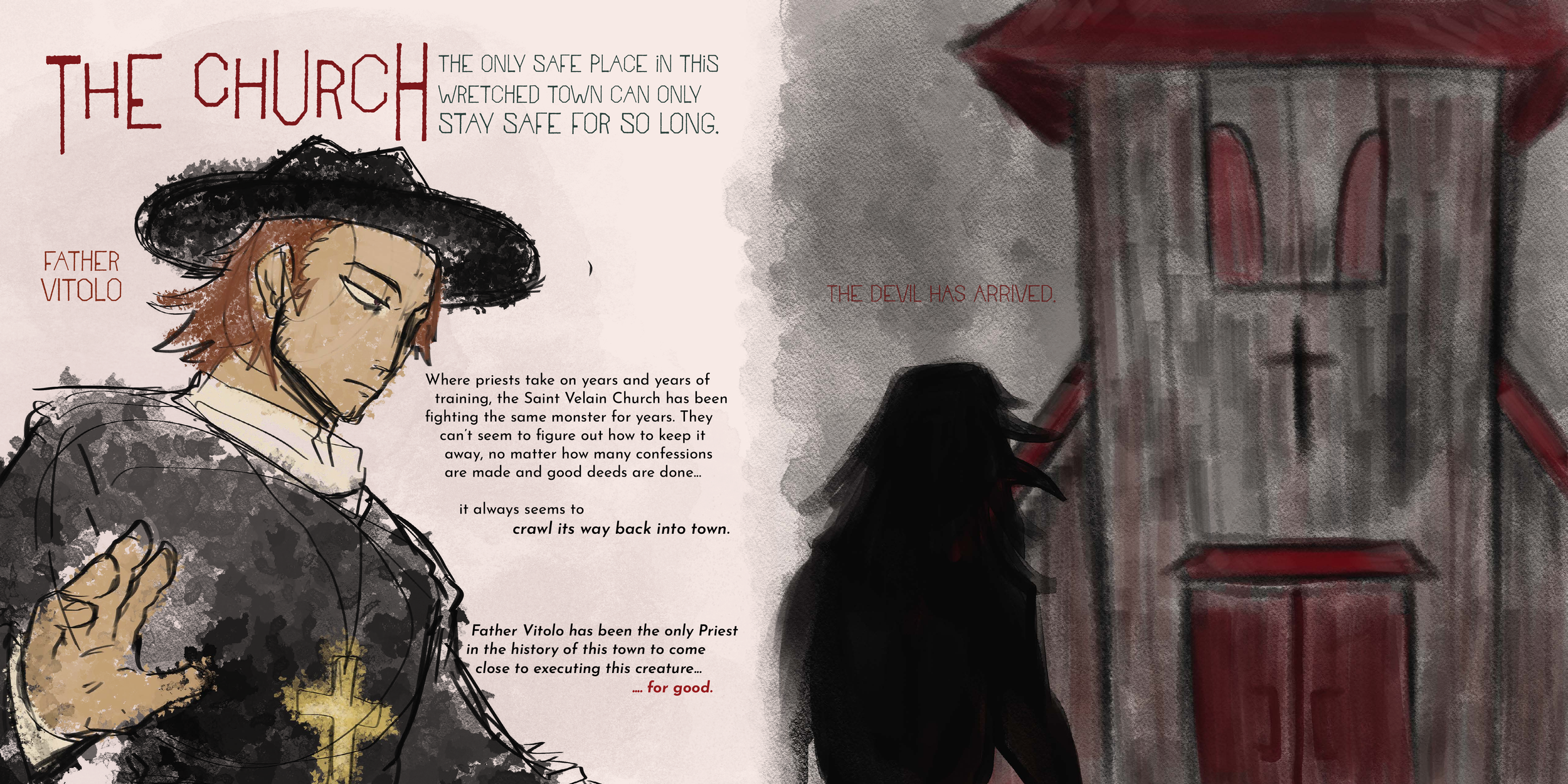
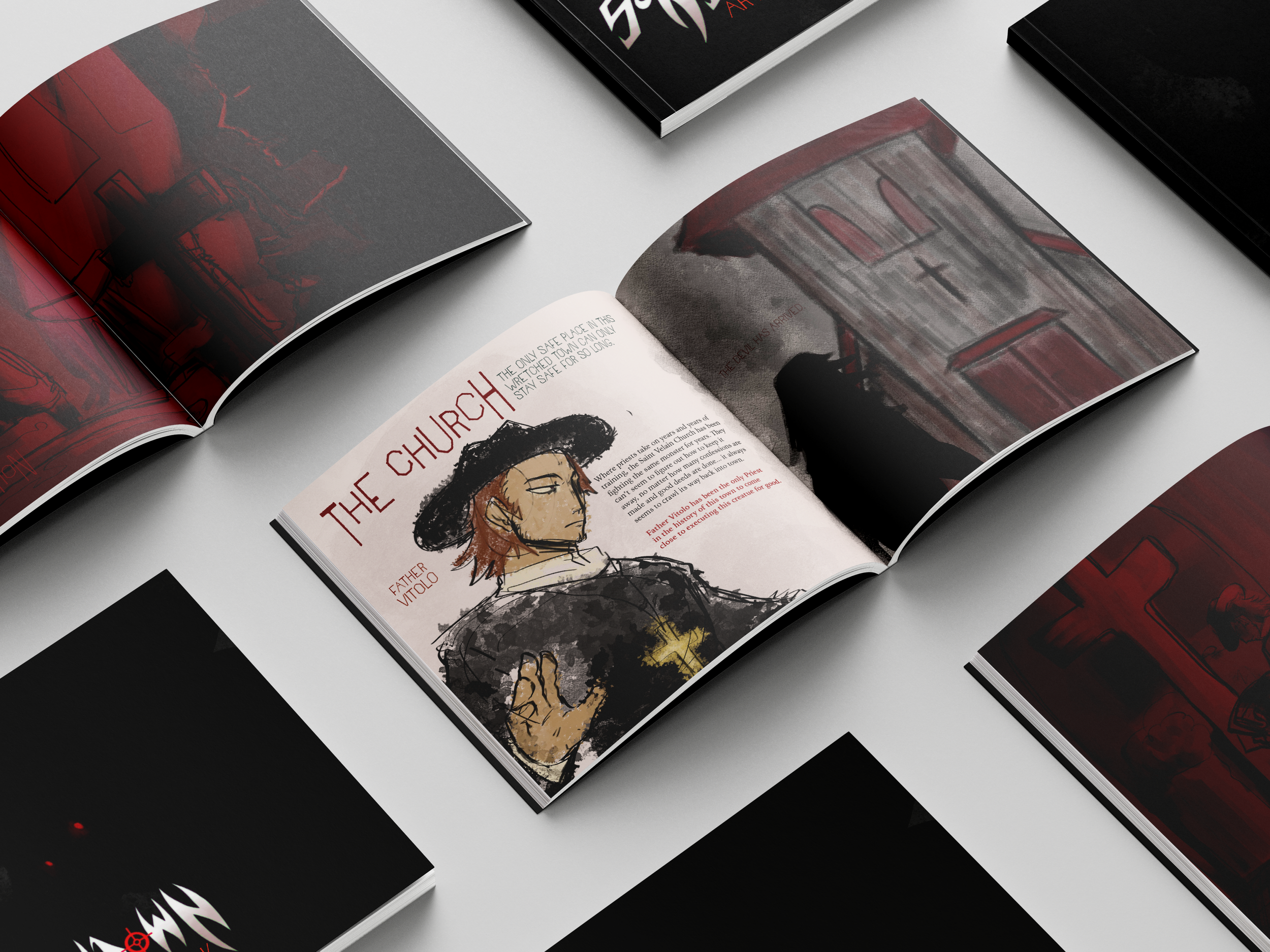
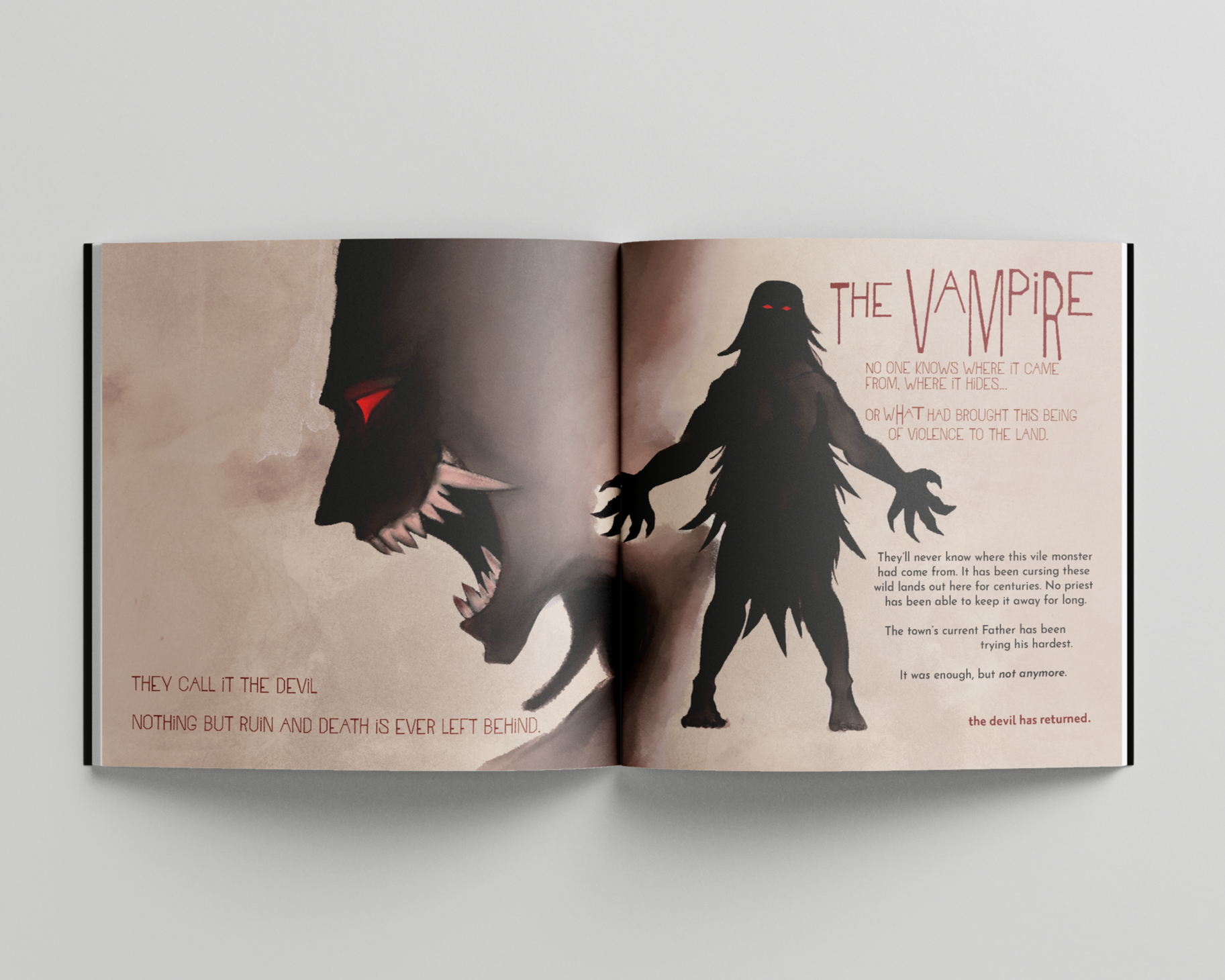
Art book sketches
first layouts
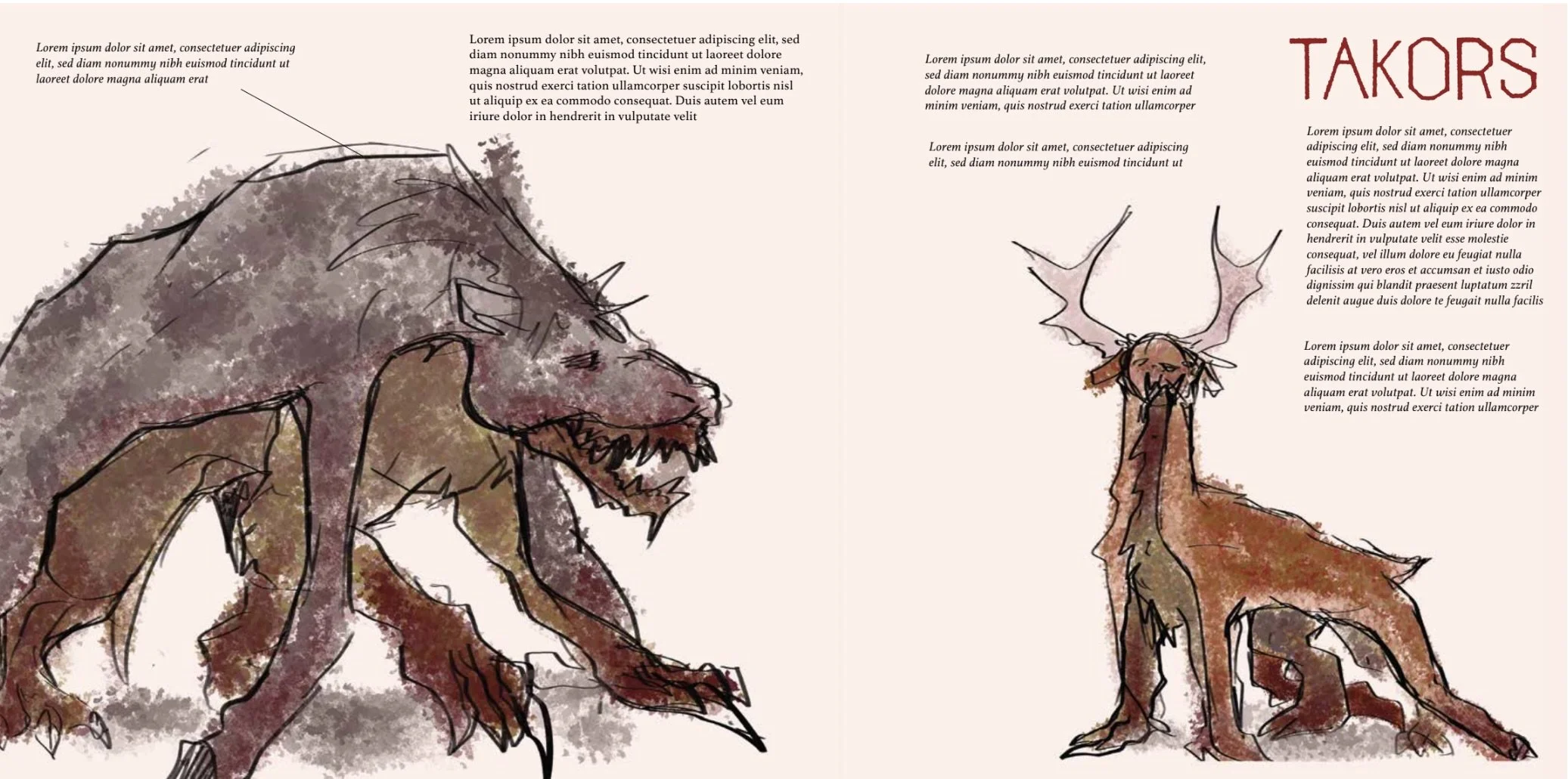
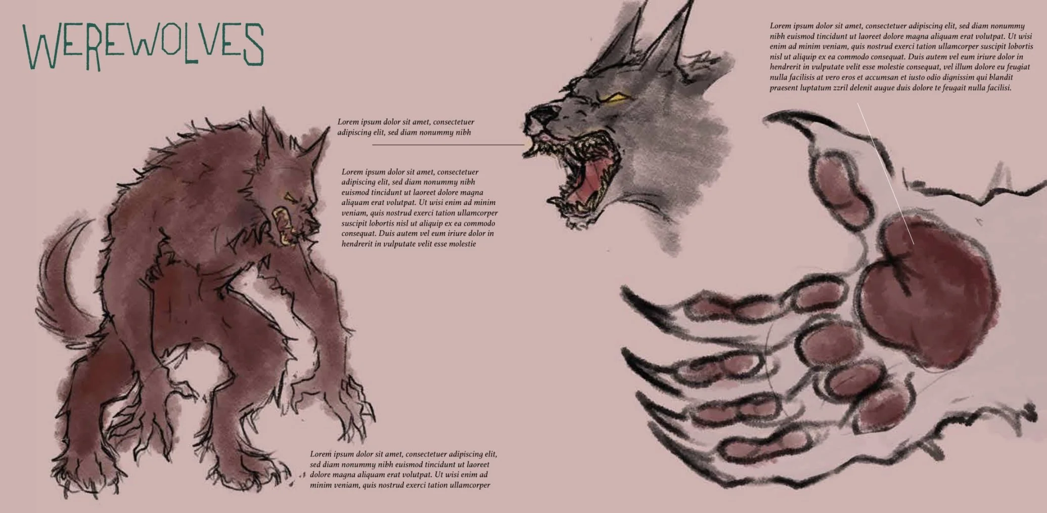
final layouts
I was confident in my choice for doing an additional art book for this concept because I had a lot of assets from the game menu and I was eager to expand it. 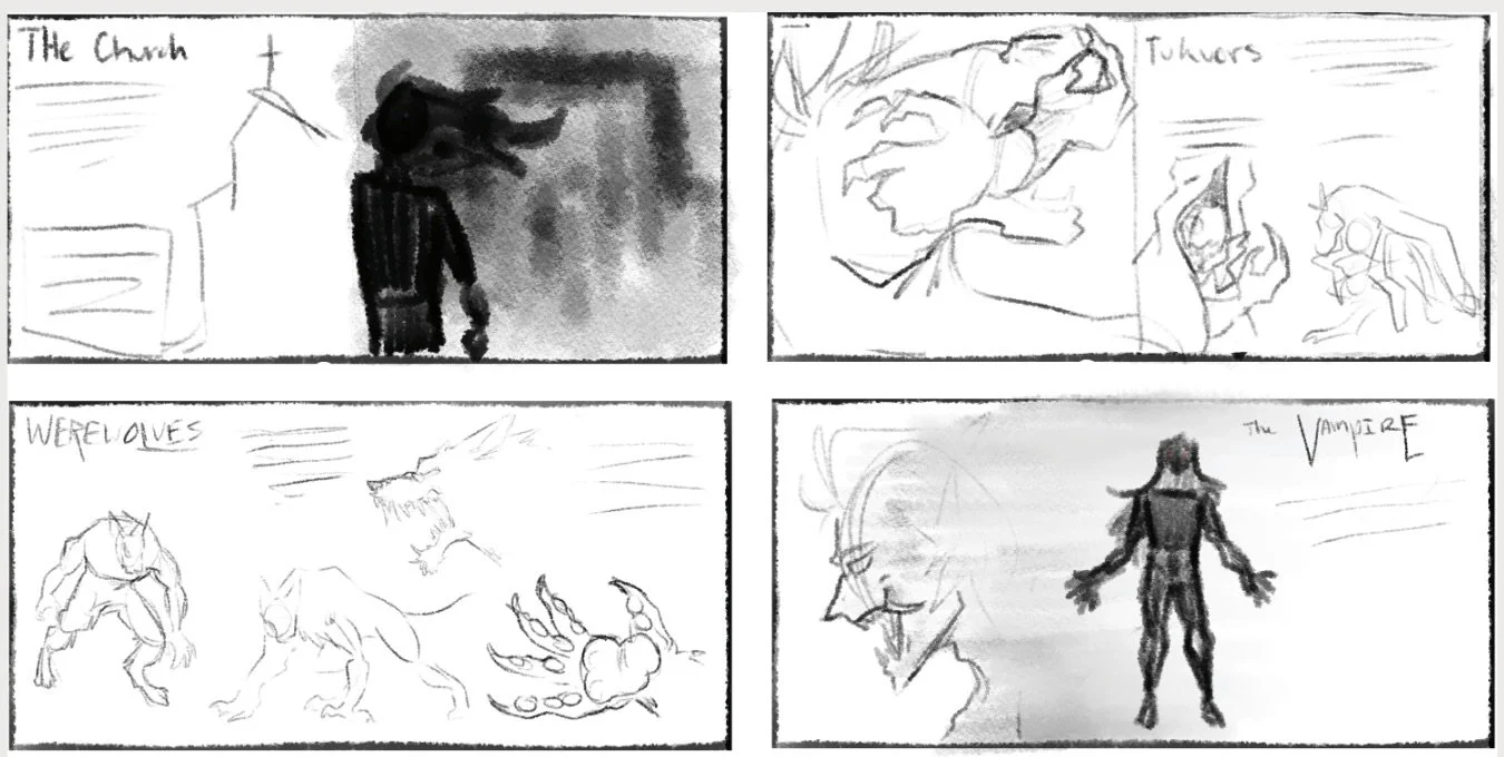
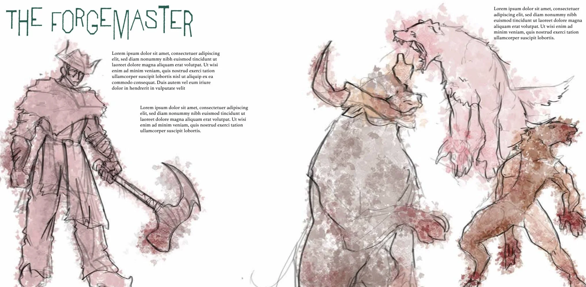
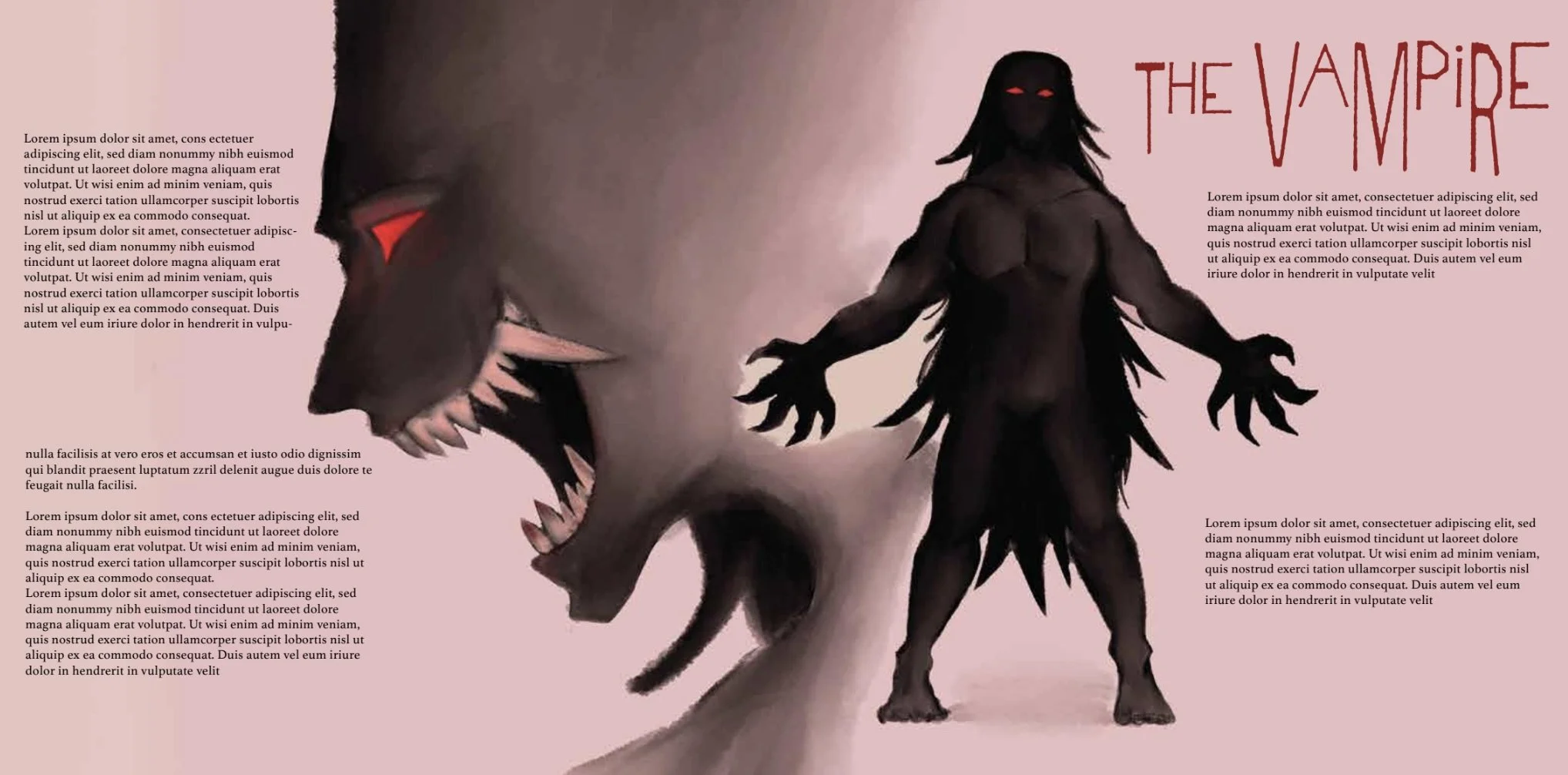
I mainly wanted to figure out where I wanted text and illustrations to be on the layouts, and that would put the entirety of it into action. I also wanted to decide on a background color for the pages to see how they’d work with the other elements on the page. I ended up changing some of the illustrations and adjusted the type to fit both the theme I was going for and to make it more visually interesting on the layouts.